 Open Data, Design, & Development at the Office of Natural Resources Revenue
Intro
We were given the task to redesign the top of the homepage—particularly the content to the left which explains the scope of the data on the site. This content explains what happens with the payments companies make to produce energy and minerals on federal and Native American lands, and then where these payments go. The data on the site includes revenue, disbursements, and production.
Original homepage before redesign

The paragraph is meant to explain the scope of the site as simply as possible. However, there are two issues: (1) It’s not visual which overlooks more visually-oriented users, and (2) its simplicity doesn’t accurately explain the scope.
Ideations and iteration
When first tackling this problem Brandi started with the paragraph on the homepage and restructured it in different ways to see how the information could be condensed and organized for easier understanding visually. This was condensed into the two sections below.
| Who | Companies | ONRR |
|---|---|---|
| What | Pay to produce energy and minerals from federal and Native American land and water, which include bonuses, rents, and royalties. | Collects these company payments and distributes them to federal and local governments and Native Americans. |
Based on this straightforward organization, Brandi was able to sketch and mock up ideas for the homepage graphic.
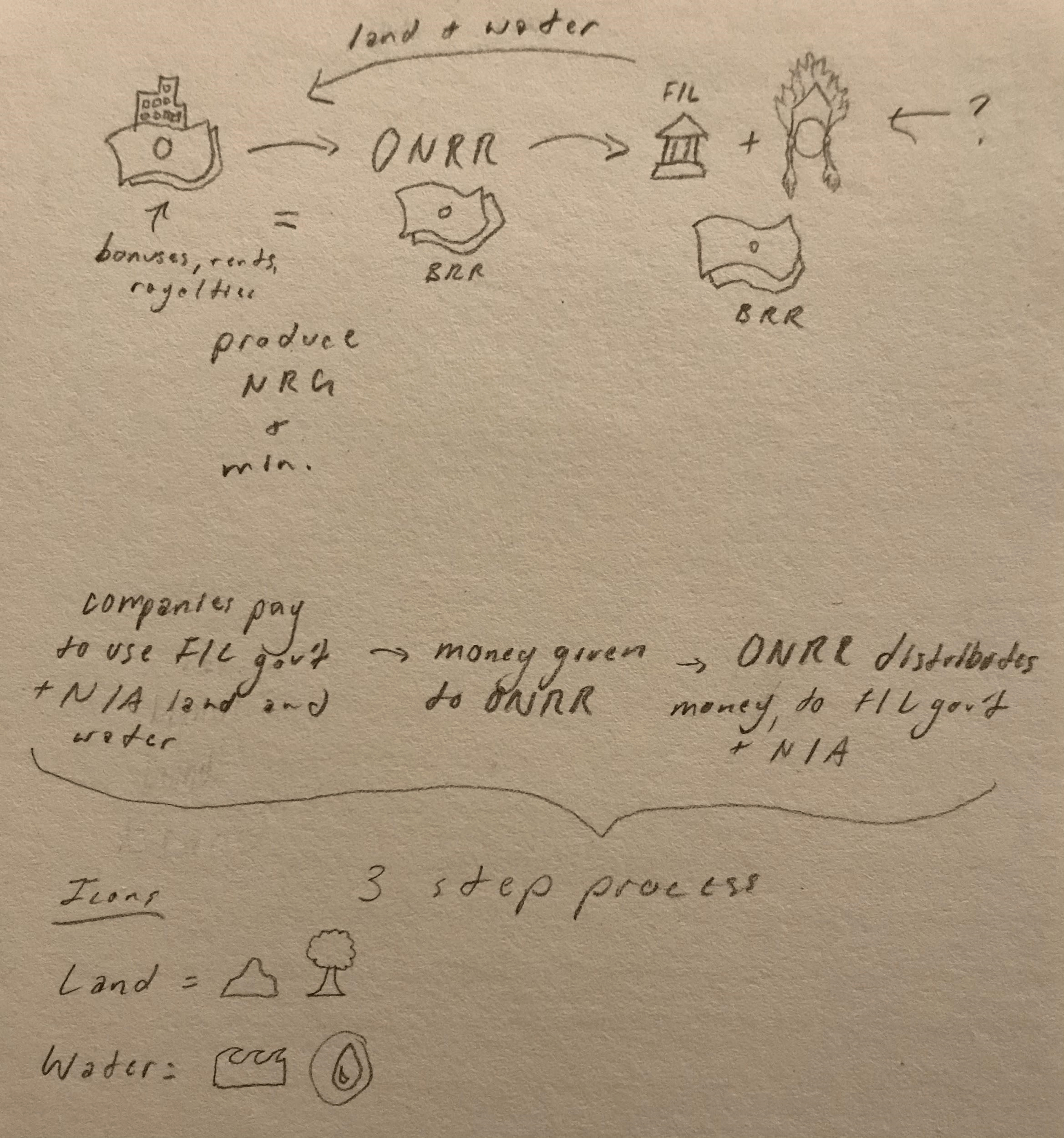
The first mockup was a bit complex, which we thought would overwhelm the user. Brandi knew it needed some condensing, but wasn’t sure how to accomplish that.
The team agreed with her at the next intern meeting. Additionally, some icons needed to be replaced and the process, as indicated by the arrows, required simplification.
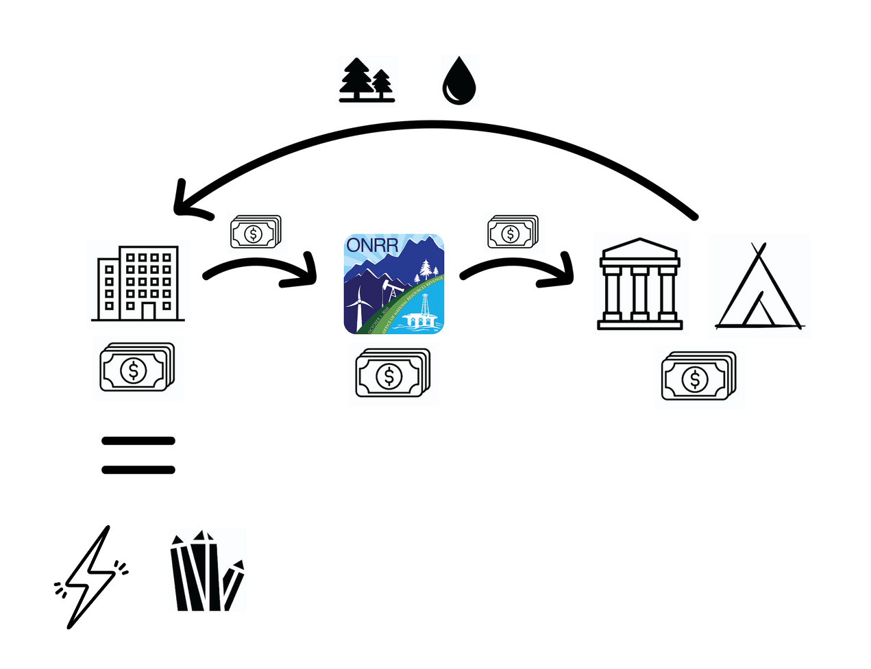
From that feedback, two versions of the graphic were created: one going in one direction (left to right) and the other one in a circular process.

To help out, Sarah was invited to the project to have more brains to come up with a solution.
After a conversation, we decided to present to our mentor, Shannon, both versions to see what improvements could be made.
When presented, we learned that the process isn’t cyclical so the circular diagram would not communicate the process accurately.
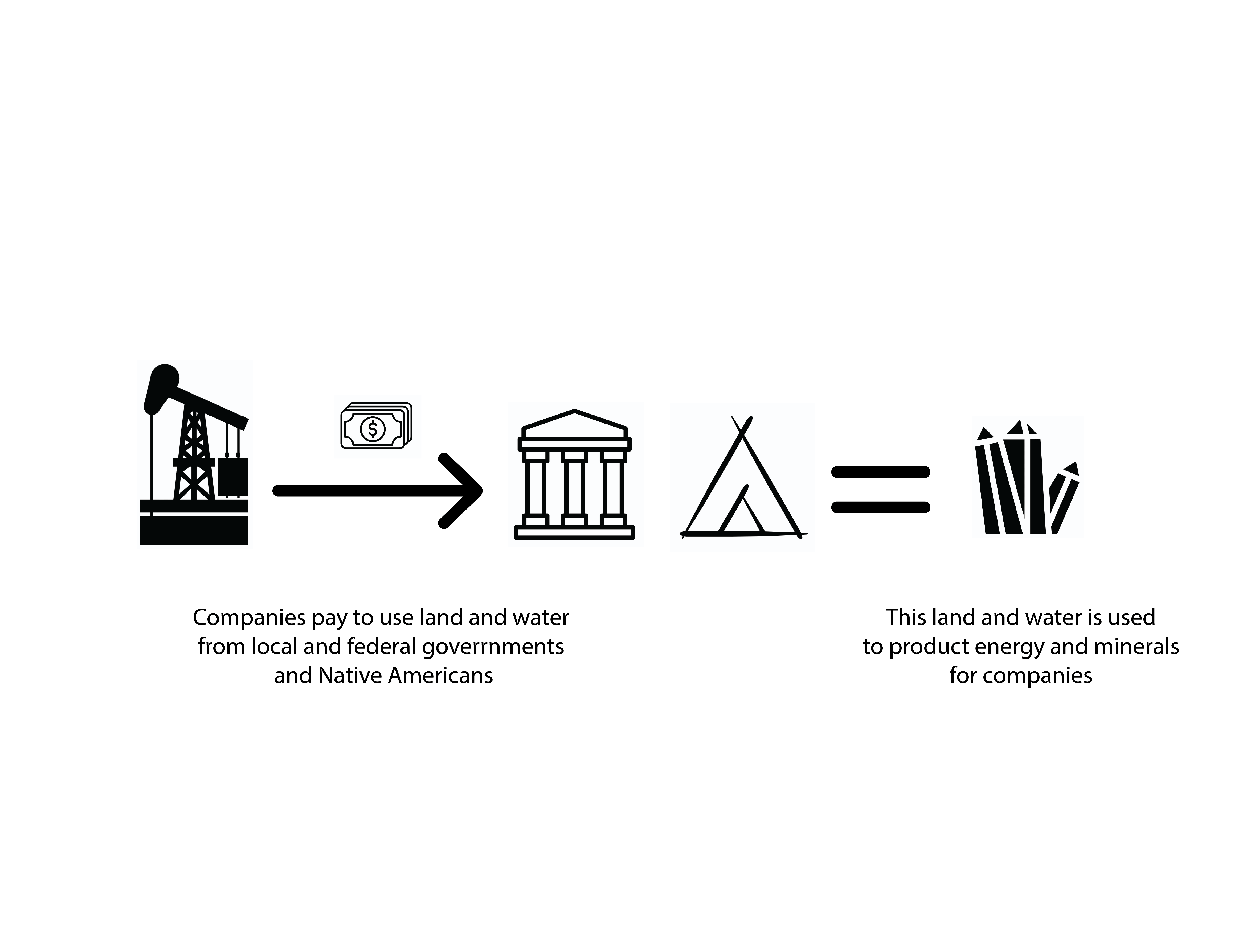
Shannon also offered feedback on the text to better describe the process. Furthermore, she advised us to look at another intern’s diagram for content inspiration.
In addition, we were given a creative brief which helped to remind us of the goals to be accomplished for the homepage.
Mini creative brief
Summary of the problem statement or purpose of the product:
Something that visually shows the scope of the site at a glance for people who don’t read the paragraph.
Key users or personas of the solution:
- Questioners/answerers
- Storytellers
- Agenda supporters
- Domain learners
- General public
Main scenarios in which the solution will be used:
Users come from another site to the homepage. They see the graphic which shows the scope of the site.
Established business goals:
- It has to be clear that we’re referring to federal governments & Native Americans, but not private and state-owned.
- We must have revenue, production, and disbursements.
Followed design principles:
- Make it accessible. There should be alt text and consider color contrast.
- Stylistically (and in copy), it should be consistent with the “how data datasets fit” diagram another intern made.
The creative brief made us more mindful of the key users, the main scenario in which they would encounter the solution, as well as ensuring the design met the business goals and followed certain design principles.
From the feedback and creative brief, Brandi then sketched a few card-based formats to explain the linear step-by-step process and was mindful of both simplifying the copy but also making it detailed enough for accuracy. Additionally, Sarah voiced that perhaps a card format would better suit accessibility standards.
While we preferred to work more collaboratively, scheduling constraints prevented that. Therefore, we decided to work on the task independently and come together during the intern meetings.
Card design concepts


In the last version above, Brandi included an interactive description element which would slide up to provide more detailed information. Brandi’s card-based and interactive format inspired iterations moving forward. Additionally, the product manager, Maroya, suggested that the entire horizontal space at the top of the homepage could be utilized.
One version that Sarah designed is above. Again, a card-based format with interactivity was included—inspired by Brandi’s iterations. In Sarah’s design, she included four ways in which the content would be understood:
- The headings of the cards provide a way to scan the process quickly.
- Icons accommodate visually-oriented users.
- The copy at the bottom of the cards communicates the process simply.
- An interactive component, when clicked on, flipped the card over to a more detailed description, providing a space to more accurately convey the scope the site.
Writing a usability plan
Additionally, we needed a usability plan. Shannon provided an interview guide which Brandi based her plan on.
The introduction was similar, however some content from the guide was adjusted to suit our particular task.
Brandi researched usability study templates and added elements addressing the tasks, goals, success and failure standards, as well as the type of users they were to recruit.
Recruiting users
Because the user group we were targeting was the general public, this enabled us a wide pool to recruit from. Brandi and Sarah focused on their social network for quick recruitment including friends, Facebook, and LinkedIn.
Conducting the interviews
The interviews were conducted by Sarah, Brandi, and Shannon, with internal staff who volunteered as notetakers. We rotated the order in which the designs were shown to users to reduce bias. There were three designs users were presented with: two re-designs and the existing homepage which Mojo, a developer on our team, suggested we include in the interview.
The interns were presented with a few challenges that required them to think on their feet. At one point, Brandi had to conduct an interview on her own without a note taker; this meant she had to be even more attentive to user feedback while asking questions simultaneously. In addition, they had a few no-shows. The interns learned that these challenges were a common part of the interview process and adapting to them was necessary skill to be learned in UX research.
Research outcomes
The findings (Excel) revealed that most users responded more positively to the four-card layout with four ways of reading or visualizing the process. Users had also communicated that particular option helped them understand the scope of the NRRD site, especially because it provided an option to access more information. Participants liked how the interactivity worked in the two card version.
We landed on a hybrid of the two options with three cards and similar interactivity to the two card version.
Lessons learned
In going through this process, these are some of the lessons we learned.
Brandi:
“It’s good to have different iterations of one solution because you can learn what elements are effective for the user and which ones aren’t. This can even lead to a combination of the iterations to find the best solution.”
“There are a lot of working mechanics and parts into solving one problem (identifying the problem, creating interactions, user interviews, and analyzing findings).”
Sarah:
“Independently designing, iterating and then coming together to share multiple ideas is useful. It gives us the opportunity to combine our ideas for a possibly more effective prototype.”
“It’s important to have a plan but expect the unexpected. We were sometimes required to think on our feet. For example, if the users were not yielding the information to answer the goals, we had to go off script.”
“It’s best to do interviews with multiple note takers. People capture different pieces of information that one or two people may miss. Additionally, a detail that most of the group notices may mean that it is especially important.”
CREDITS
ICONS
Cash by DinosoftLab from the Noun Project
Teepee by Andrejs Kirma from the Noun Project
Government by The Icon Z from the Noun Project
Mineral by IconMark from the Noun Project
Building by Alice Design from the Noun Project
Lightening bolt by priyanka from the Noun Project
Tree by Icongeek26 from the Noun Project
Oil by Chintuza from the Noun Project
Oil rig by Patrick Trouvé from the Noun Project
Government by Adrien Coquet from the Noun Project