 Open Data, Design, & Development at the Office of Natural Resources Revenue
What the heck is hallway testing
Before my colleague suggested the use of hallway testing, I had never heard of it before. Luckily, both she and a simple internet search provided ample guidance and examples on how to conduct this form of research. Hallway testing allows user experience (UX) researchers and designers to ask random individuals from the hallway (a more casual request for participation) to test a product that is under development. Our team is located in different parts of the country, so we couldn’t ask hallway bystanders for 15 minutes of their time to do an impromptu testing session. However, we could send a chat message to different colleagues in the agency to schedule a casual, short chat to discuss a webpage that we were hoping to improve. Since many of our coworkers know our team and over time we have built an understanding of our human-centered approach, we thought they would be receptive to helping us out with this task.
The pros of hallway testing
- Quick interviews
- Easier to recruit (low time commitment, less intimidating request)
- Requires fewer resources (UX designers, time for planning, participants, etc.)
- Can identify many usability problems within a product
The cons of hallway testing
- Interviews cover less topics (because they’re shorter)
- Often doesn’t test the true user group
- May not get the whole picture of how a user is using product
Why focus on the state and offshore region pages?
In Spring 2024, we reassessed our search engine functionality for the revenue data (NRRD) website, and the state pages and offshore region pages appeared in our search results, but there wasn’t an easy way to access them. It was a good reminder that they exist and we should revisit them. These pages contain a few sentences about the location and then links to filtered datasets within Explore data and Query data sections of the site. To get a sense of these pages, you can access the Oklahoma state page and the Atlantic offshore region page.
Our analytics showed that there was a moderate number of users viewing the state and offshore region pages. However, the revenue data website did not provide navigation for users to find these pages through the homepage or other website pages. This issue of missing page navigation violates accessibility guidelines, so our team prioritized it for hallway testing.
Hallway testing would allow us to do user-informed research but reduce the burden on our small team since we have limited capacity to do a full user research study. These state and offshore region pages are not the most common way for users to access different datasets, so our time is better spent conducting user research on higher trafficked pages.
Process for hallway testing
The team identified users of state and offshore region pages as reporter (resource royalty payors) and storyteller (elected officials or government employees) user types. By considering user types and using past user research, we developed three prototypes to create navigation to individual state and offshore region pages. Then, we recruited 3 ONRR employees for the hallway study. We asked them around five questions related to the product and prototypes, which we have generalized in this list:
- How the product would be used
- Where they would expect to find the product
- Preference between the two prototypes
- General input on improvements to the product
Prototyping part one: hallway testing the initial prototypes
The participants from the hallway testing provided a wealth of insights into the navigation to the state and offshore region pages. Participants were introduced to the state pages and then were given the opportunity to click through two limited-functionality prototypes, options A and B. Both options provide similar buttons that link users to the different states and offshore regions individually, but they differ in the initial navigation to these buttons.
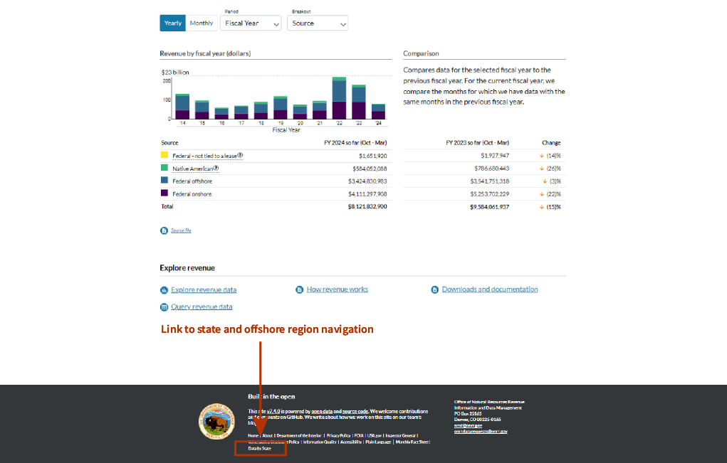
Option A
- Option provides a link to the state and offshore region navigation page in the website’s footer.
- Additional page contains the state and offshore region navigation buttons.
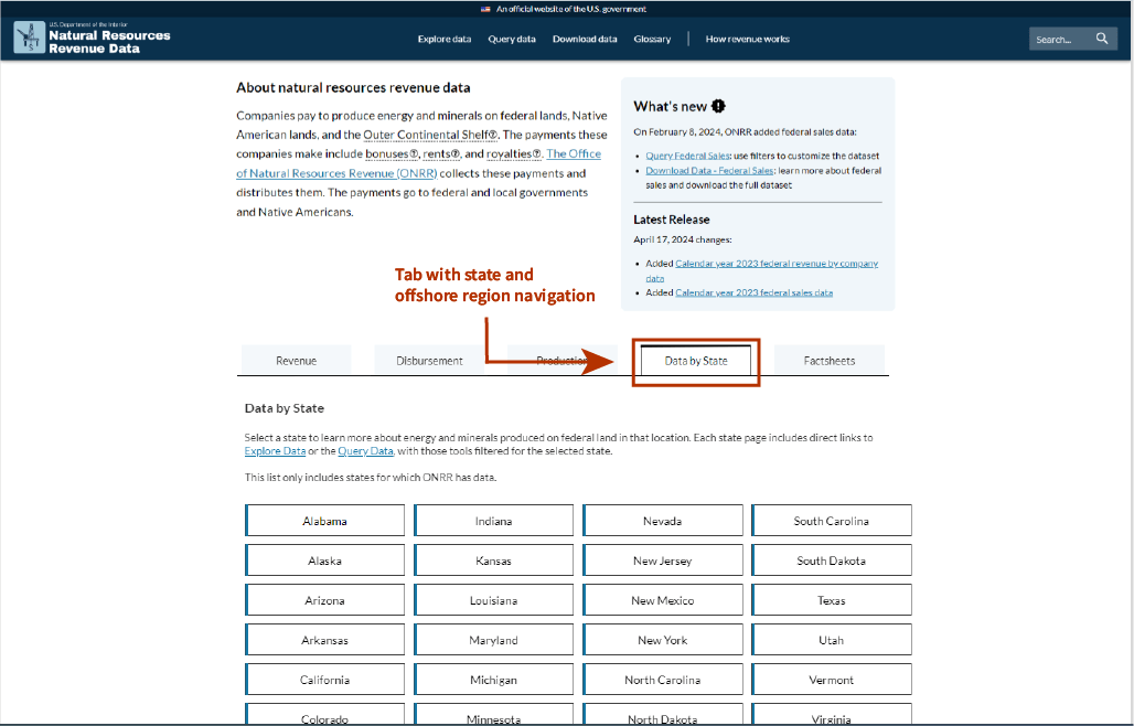
Option B
- Option provides an additional tab, “Data by state”, on the homepage.
- Tab contains description and the state and offshore region navigation buttons.
Option A prototype:
Option B prototype:
Hallway testing insights
Participants provided the following insights for prototype options A and B:
- Users could be state engineers or state revenue resources department employees, who must pull specific state values.
- Participants expected to see the new navigation page as a tab on the homepage or within the homepage’s tabs.
- Participants could not find the navigation link in the footer in prototype option A.
- Participants requested that we improve descriptive introductory text on the navigation page.
This round of research also provided feedback that was beyond the scope of this project:
- Participants said that the navigation page could include a map of the entire U.S., where users could choose the state or offshore region by clicking on the boundary of the state or offshore region.
- Participants said that each state or offshore region page could have a small map that shows the boundary of the state or offshore region, the larger context of it within the U.S., and a layer that indicates the federal or tribal land in states.
Prototyping part two: more focused prototypes
The insights from the hallway testing led to a second round of prototypes that focused the navigation to these pages in the tab section of the homepage. We created three additional prototypes, options C, D, and E:
Option C
- Option alters the current “Fact sheets” tab to include state and offshore region navigation.
- Tab contains current content and adds a description and the state and offshore region navigation buttons.
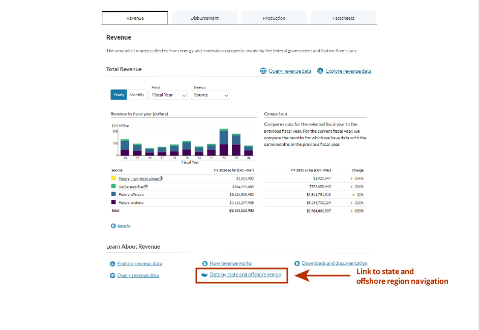
Option D
- Option provides a link to the state and offshore region navigation page with the three data tabs of the homepage.
- At the bottom of each tab, there is a section that contains several links to other parts of the website. The link, “Data by state and offshore regions” is listed in this section.
Option E
- Option provides a link to the state and offshore region navigation page with the three data tabs of the homepage.
- At the top of each tab, there are links to the query tool and the explore tool of the website. The link, “Data by state and offshore regions” is listed in this section.
These options were presented to the team for their preferences and feedback. The team chose option D because it aligned best with the insights provided by the participants in the hallway testing.
Option D prototype:
Implementing recommendations and building the product
After gathering two rounds of feedback for the prototype, we selected the best option, Option D. Then, we moved forward with building the pages in the site’s code. Alex (digital experience or DX) and Jeff (developer) worked together to find where the different components lived within the NRRD website’s code. Creating the page itself in an MDX format was simple. MDX is an extension to Markdown that lets you include JavaScript components in Markdown documents and supports inline HTML. We built the JavaScript component, which took more effort because Alex and Jeff had to research how to create the desired aesthetic. We considered using a grid, but eventually used flex boxes with buttons to depict the individual states and offshore regions. Flex boxes provided flexibility in button size and number of columns. We used a popular Artificial Intelligence (AI) chatbot to help us develop the code itself. We told the AI chatbot the JavaScript library and component library that we use on the NRRD, the need for creating state buttons, and the requirement for using flex boxes. From there, we iterated on the code by defining the requirements and having the AI chatbot alter the code after each requirement request.
We refined the descriptive text content on the navigation page to make sure that it had the right balance between providing context and being concise for readers. Finally, the team did a final review and then published the data by state and offshore region page.
Next steps
As a part of our next steps, our team will do the following:
- Monitor these pages using Google Analytics to see how the pageviews and events on these pages change with the new access via link on the homepage and the navigation page.
- Reevaluate the addition of maps into individual state and offshore region pages and to the navigation page.
- Do more hallway testing to add more functionality to the navigation page and the individual state and offshore regional pages.