Our organization’s leaders made the decision that both our public websites should be managed by the same team. So, our team inherited ownership of the onrr.gov site in March. So far, we’ve made progress on understanding the site’s users and documenting its current state, and what we’ve learned working on the Natural Resources Revenue Data (NRRD) site will serve as our roadmap as we look to enhance the user experience on onrr.gov.
Benefits of the move
The team that previously managed onrr.gov included only one developer, who made all of the substantive changes to the site, as well as some other members who helped with usual updates. That team also has many other responsibilities, including managing our intranet site. So, onrr.gov only accounted for approximately 10 total hours of their work per week. To facilitate a greater focus on onrr.gov and a consistent approach for our public sites, our team gained one position.
When our group was told that we would be responsible for maintaining the onrr.gov site, we thought about how we could bring what we’ve learned from two years of managing NRRD to our new work. Here are some ways we want to apply our existing capabilities and understandings:
Shared resources
Our team is lucky enough to currently have three developers, a user experience designer, two program analysts, and a product manager. We also have a vacancy for a content strategist. Our cross-functional, user-centered design and development team has an array of experience, and over the last couple of years together, we have made efforts to share our knowledge and develop new skills. While we only have one position dedicated to working on onrr.gov, no one person has expertise in all areas of web design, content, and development. Instead of assigning one person to manage everything on onrr.gov, we can deploy appropriate resources from our pool of talented individuals based on priorities and emergent needs. The flexibility of moving people between our products will allow us to apply what we learn on one to the other and effectively manage our time to maximize the value we’re producing for users of both sites.
Branding and design
The NRRD site is linked from onrr.gov because NRRD is our organization’s official avenue for sharing public data. The two sites are certainly related since it is the same organization—and now the same team—managing them, but they are currently not consistent in their visual appearance. Users arriving to NRRD via onrr.gov have expressed that the user interfaces feel disjointed. We can now take advantage of managing both products within our team to bring a more cohesive look and feel to users of the two sites. That is not to say that we want the design and branding of the two sites to be the same—as they are intended to address different needs, often for different audiences. We want the design and branding of each site to flow from and reflect what we know about the problem spaces and users of each site. Still, now that we manage both sites, we can use our team’s branding and design experience to ensure that users of both sites have a more consistent experience.
Where we’ve started
Discovery
Since we are lucky enough to currently have two virtual student interns who are working in design and user experience, we decided our initial onrr.gov discovery was a great way to put their skills to use. They started by performing a content audit of the site. That was no small task because there are a lot of pages and content on the site, but it was an essential first step for us to understand the scope of the product we were to manage. Our UX Designer was also able to work with a previous site manager to get some results for a survey conducted on site users about three years ago. While the previous site manager did redesign the site after the survey, we still found reviewing those results quite helpful in understanding the users’ most-common tasks and problems. Using what we’d learned from the survey data and the context we know about our organization, we were able to start creating provisional personas of our users. As part of our discovery process, we also reviewed the analytics for the site to identify what parts of the site users go to most, search terms, devices, browsers, the total number of users, and the types of users to the extent that can be identified.
User research
We also wanted to start talking to users of the site as soon as we could, so we created a plan and began conducting user interviews in our first sprint. During the initial round of user interviews, our goal was to test our hypotheses about the site’s user types, understand the questions they want answered and the tasks they want to perform through the site, and gain insight into anything they struggle with when trying to accomplish those tasks.
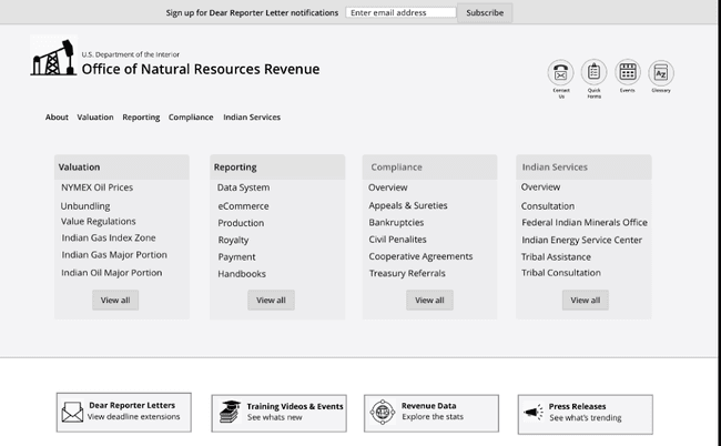
After our first round of research, one of our interns developed two prototypes for the homepage and reporter checklists to address a couple high-priority problems we had learned about from the survey results, the analytics, and our first round of user research. We then tested the prototypes with users to get an idea whether the simplified designs address the issues that we knew some users experience with the current site. One of the high-priority issues is that users, especially those who are not frequent site visitors, struggle to find the pages or resources they need to complete their intended tasks. While this prototype will not be our final version, the testing gave us some good feedback about narrowing down the content on the homepage.
 Image: Homepage prototype that was tested with users
What’s next?
Over the last couple years, we have experienced how important it is to have a product framing document for NRRD. It has been essential for our team to refer to these high-level guiding product principles when we’ve encountered tough decisions about how to prioritize our resources on that site. We know we need a similar document (including a problem statement, vision, personas, and user scenarios) for onrr.gov. We plan to work with a larger group of site stakeholders, especially the content creators throughout the organization, to develop that document and ensure we have a shared understanding of the site’s purpose and goals. Our plans to hold a workshop to work on the product framing have been put on hold a bit as we had hoped to have it in-person. We may re-plan the workshop to function virtually because it is one of our top priorities in the next couple months.
We have a lot of questions we need to answer to move forward with the site. The product framing document will give us a good foundation for making decisions about the direction of the site. After learning more by working with the content creators, we will design a roadmap. Our end goal is to maximize value for the users and ensure we choose the appropriate technology to address user needs and allow for sustainable content-management processes.
With a small team, and the need to ensure we properly prioritize resources between the two sites, we have challenges ahead of us. Still, we are confident that we can use what we’ve learned on NRRD to have a positive impact on onrr.gov users as we move forward.
 Open Data, Design, & Development at the Office of Natural Resources Revenue